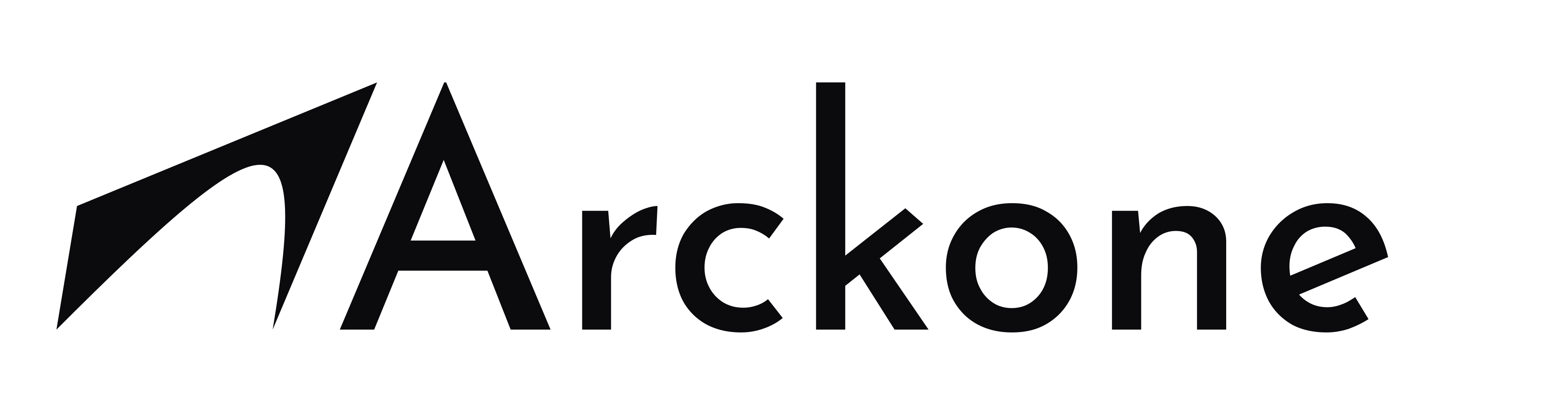
Logo, colours and type.
ARCKONE logo, colours, typeface and style rules, ready to download for press and partners.
Logo
The full logo is the main mark. The symbol stands alone where space is tight, as an avatar or an icon.



SVG for print and documents, PNG for tools that do not accept SVG. Transparent backgrounds.
Colours
Brand blue marks what can be clicked and the line illustrations. Text and logo stay in ink on a white page.
- Brand blue
#002FA7RGB 0 47 167 - Ink
#111111RGB 17 17 17 - White
#FFFFFFRGB 255 255 255 - Secondary text
#4B4B4BRGB 75 75 75 - Muted text
#616161RGB 97 97 97 - Soft surface
#EEF1F6RGB 238 241 246
Typography
Archivo is the only typeface on the site: headings in 700 and 800, body text in 400. It is free under the SIL Open Font License.
Archivo on Google FontsSoftware and AI that run your processes.
Style
ARCKONE comes from the arch, the basic structure of architecture, and “one”.
- Write ARCKONE in capitals in running text. The logo keeps its drawn form.
- Use the black logo on light backgrounds, the white logo only on dark ones.
- Do not recolour, stretch, rotate or add shadows, outlines or other effects to the logo.
- Rounded corners everywhere: 14, 20 and 28 px, and pill-shaped buttons. No square corners.
- One light glass, only over a film or an image. On white, soft surfaces and plenty of space.